WEEK FIVE - LAB I
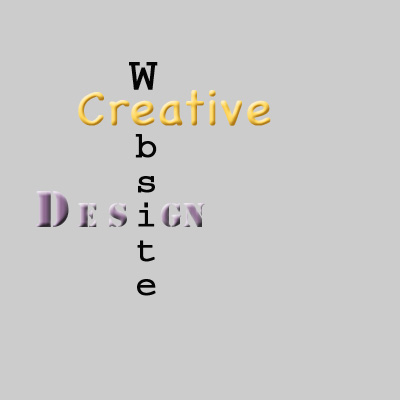 I tried to chose the fonts and colors to match the three different words.
Chalkboard and orange for "creative". Chalkboard font reminds me of work done on a chalkboard, work by hand that can be esaily erased and worked again, suggesting painting with words; orange is energy, exotic, young.
Courrier and black for "website" suggests the informative, professional, more serious aspect of a website.
Stencil and purple for "design" gives a stylish, modern, classy look.
The three words interlace showing that they have to work closely together.