WEEK THREE - LAB II
Since we are our own clients, and our website will be sort of hybrid, it was difficult to find competition as such... So I tried to find a translator's website (not an agency) I never realised that there were so few...Most of them were really badly done, poor quality, poor writing, very amateurish. I chose the example below because, although it is the worst site I have ever seen, what it says very clumsily is somehow getting close to what we want to achieve as far as translation is concerned.
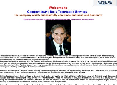
Comprehensive Book Translation Services
- Everything about the design of this website is wrong. Too many fonts and colors (harsh ones as well), poor picture quality, no balance, no hierarchy, practically everything is on the same page. It's a shame, because I think he probably does a good job, but the look of his website is totally unprofessional. Translation is working with words, so the written content of the website has to be of high quality to inspire trust. What I like is the idea of combining business and humanity which we believe is possible, with a good dose of creativity:)
Although we will not be a translation agency, and most translation agency websites are too commercially pushy and use cliche sentences with not much meaning, I chose the one below, because it's a good example of what good content can do.
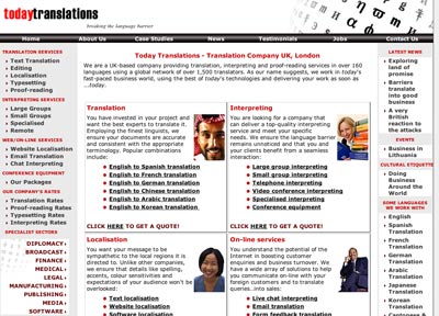
todaytranslations
- Although the design is not particularly spectacular, it is clean , well balanced, maybe lacking in white space. But the content is so well written (particularly the pages concerning the translation services) that it does not really matter. They give a concise and clear explanation of what they are offering. They are indeed offering more in terms of web technology and international internet business than most sites I have visited, so their brand name is well chosen. It is true, the world of translation has changed considerably since the advent of computers and the internet, and todaytranslation gives the feeling that they are up to date with what is new.
Finally, I tried desperately to find a website that would mix the personal and the professional and I actually found one!
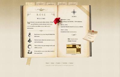
Rose
-
I love the design of this website. It is very personal, refined, delicate but well thought, structured and easy to navigate if you take your time. You can chose to view it with or without the graphics. There are unity, variety, white space, texture, hierarchy , but above all a lot of imagination. Rose is a young website designer. Her portfolio shows that she can design more conventional websites as well. She chose the name Rose - Personal website, which might not be a catchy name for a designer, but it is actually by searching with "personal website", that I found her!
So to conclude. I think that more and more people will be looking for more personal websites, so that they feel that are not just another paying number, but somebody that will be looked after. We are going back to the small shop, where one is personally greeted, and where quality is more important than efficiency and profitability. I think that there is a niche for people like us, and I truly believe that we are not the only one thinking this way out there:).