COMPOSITE
STATEMENT OF PURPOSE
This website will represent Jean-Paul and myself, who we are and what we have to offer. Tropicalboubou is our trademark, the name of our website and our e-mail address. The tropical boubou is a bird we have in our garden. It is black and white and not especially beautiful compared to a lot of other species in this region, but we like them because they are monogamous and once they are pair- bonded, they can sing up to 12 different highly synchronised duets that are beautiful. Somehow we feel close to that...
We are crafts people dedicated to quality, integrity and personal exchanges. We intend to offer paid and free information and services on a professional and personal level. The main area of professional services is translation and related activities, i.e. editing, proof-reading, glossaries. In time, and maybe as a free service to start with, the second main area will be related to design i.e. website, artwork, logo. The personal pages will offer free information related mainly to traveling and the places we have lived in, i.e. tips, links to interesting websites, travel writing, articles. Our aim is to create an holistic and organic website which will grow and change with time, and will offer an opportunity to exchange ideas and-or services. We will not depend on this website to earn a living. Our audience will primarily come from links to our website from the translation community. Many people will probably access our website through internal pages whether professional or personal. The private page will be dedicated to family and friends only, and will be accessible through a password.
Week 1
Week 2
It has been very difficult to write the statement of purpose above, and I am not sure that it is complete or precise enough yet. This idea of a website doesn't really fit with the three main types of websites as defined by Flanders: informational, commercial or for entertainment. It will be a bit of all but with a difference, maybe a human dimension...It might not work at all, and if it doesn't then maybe we don't belong to the web community :) As I said, we will not depend on this website to earn a living so we want to try a different approach that is closer to who we are.
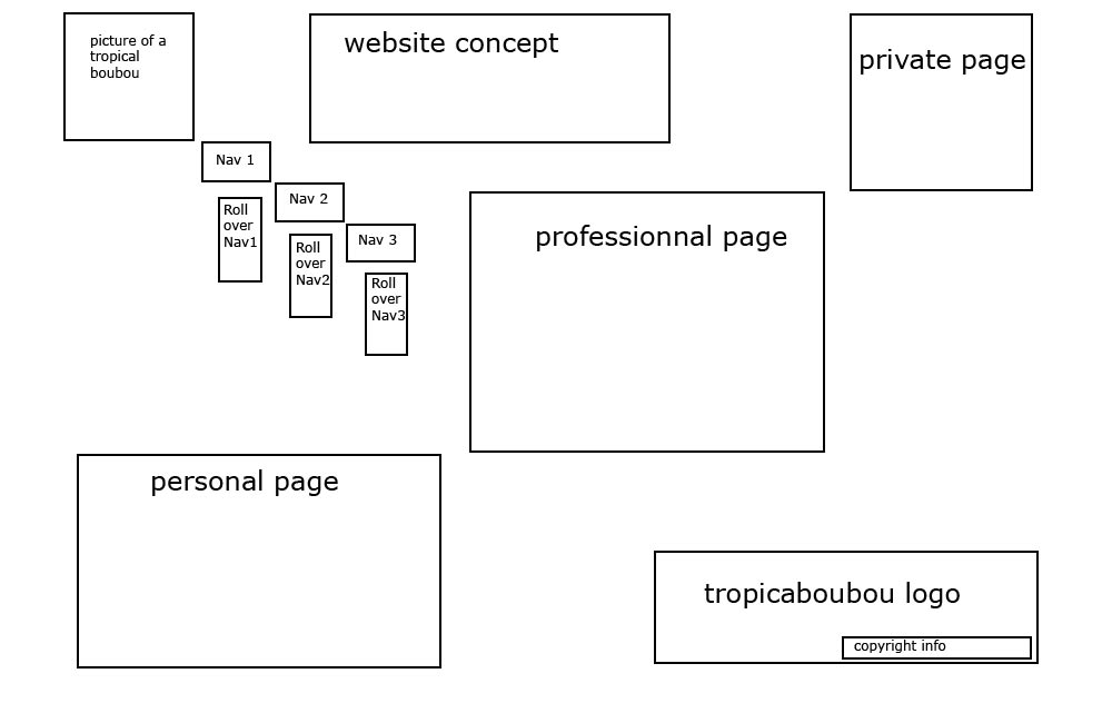
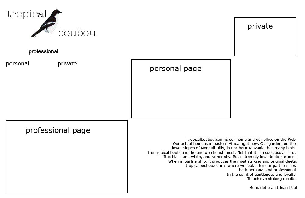 For this second week, I have mainly streamlined the design, make it less busy. I also had a try at the logo, which has also changed place. The three main links will have sub-navigation roll-over. The copyright information will come below this main box, along with the sub-navigation for each page (professional, personal, private). The internal pages will be similar but the professional page for example might expend horizontally, with a picture or artwork occupying the private box, and the personal page might expand vertically with a picture or artwork within the professional page space, etc. The aim is to keep the unity by using the same spaces but adding variety by using the spaces differently. Some pages will look different, because of the extended content, i.e. glossary or writing pages. They will open if possible as an attached document in a completely different window, and will only have a smaller logo on top and copyright info at the bottom, but no navigation bar. That's as far as I've gone this week. Even if it doesn't show much difference from last week, it has involved a lot of thinking and discussions with JP and helped us focus on what we wanted to do.