WEEK ONE - LAB I
Website 1:
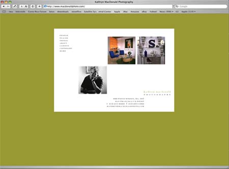
Kathryn MacDonald Photography
This site uses a lot of white space, outside and inside the page which gives a very classy feel and indicates quality and simplicity. The eye goes straight to the photos which are the most important items. There are three types of photos and three photos on the main page, all squares but not all aligned which gives variety while maintaining unity. Unity is also achieved in the internal pages, because the name and the address of the photographer stay exactly in the same place and are also part of the design, not just an addition at the bottom of the page.
What I like about this site is that through all the pages, the division of the space stays the same but only one part of that space is used and changes according to the different pages.
The only thing I would change is the photo of the man on the home page. Because he is looking directly at you, I thought he was the photographer, then realised that the name Kathryn was a woman's name. and didn't quite understand. It's only when I went through the navigation bar that I realised that photo was just an example of the "people" type of photos. So maybe the message is not clear enough, or maybe it's just me, I am a bit slow sometimes :)
Website 2:
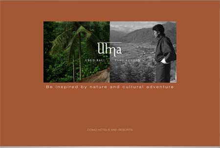
Como Hotels and Resorts
This website uses shape and white space and lines effectively to convene a sense of beauty, serenity and balance.
The main page.
There are two spa, represented each by identical squares, close to each other because although in different countries , there are based on the same principles and are both part of the Como Hotels and Resorts Company. The word "Uma" comes from the Sanskrit and means "light" or "the bright one", but it is also the name of a goddess also known as Parvati, who shows us how to balance our many aspects. The line created by the juxtaposition of the two pictures going through exactly the middle of the word "Uma" increases the sense of balance in the design but also brings the two parts of a whole together even if they are different. The line over the word Uma, is a subtle reminder of ancient and-or Asian script which suggests ancient ways of healing which are used in the spa.
The internal pages.
There is a good use of shapes. Again the square is dominant but this time it is either divided into rectangles (the three vertical divisions) or a combination of squares creates a rectangle (the photos). The proportions are also well balanced, and creates a relaxing atmosphere as does the slow pace of the changing photos. Lines (in words) are also used outside the site and by aligning them in that way, it sorts of cradle the centre piece and makes it whole and protected.
What I like about this website is that everything aims at making you feel that this is the place to relax, to experience something special that will make you feel better. The photos are superb, so you don't want to rush to get to the next information, and you want to see every page.
The downside of the beauty of the site is that you need a good connection because it takes time to download but again, if this is the kind of holiday you are looking for, you don't want to rush, you want to be sure that this the right place for you.